Introduction
The border-style property in CSS allows developers to control the look of borders around HTML elements. Through the use of border-style, developers can define the line type used for borders, such as solid, dashed, dotted, or none. The ability to customize borders is indispensable in creating visually appealing and distinctive layouts that align seamlessly with the design objectives of a website. Whether one is working on a minimalist webpage or an intricate user interface, mastering different border styles is crucial to enhancing the overall aesthetic and functional quality of the design.
This guide explores the various values available for the border-style property, demonstrates their application through examples, and provides best practices for crafting professional-quality web designs. Mastering the border-style property helps developers define content boundaries. It also enhances the overall visual experience. The distinction between a basic and a polished website often lies in such nuanced details, and effectively employing border-style is crucial for capturing and sustaining user engagement.
The application of border customization through the border-style property allows developers to convey specific visual messages tailored to the intent of the webpage. For example, a dotted border can be used to indicate areas that require user input. For instance, a solid border communicates a sense of stability and structure, whereas a dotted border might suggest a playful or transitional state. The flexibility of border styles enables alignment between visual cues and the overarching purpose of a page, ultimately enhancing the user experience by reinforcing the message conveyed by each section.
Borders in web design are more than mere separators; they are tools for storytelling, guiding the user’s eye, and creating a layered experience that adds depth to the page. For instance, a solid border can guide the user's attention to important calls to action. Utilizing a solid border for static, foundational sections while opting for dotted borders for interactive elements can convey a clear, intuitive hierarchy that enhances usability. The effective use of border styles not only beautifies a webpage but also helps improve accessibility and navigational clarity, which are critical aspects of user-centered design.
What is the border-style Property?
The border-style property is used to define the style of the border that surrounds an HTML element. It is a component of the CSS border shorthand properties and provides developers the ability to apply diverse border styles to different elements. By utilizing border-style, developers can define whether an element’s border should be solid, dashed, dotted, double, or even hidden, among other options. This versatility in styling allows for the creation of distinct visual identities for various sections of a webpage, ensuring clarity in content differentiation.
Below are some of the commonly used values for the border-style property:
none: No border is displayed. This is useful when one needs to remove default borders from elements without affecting other properties. Eliminating unnecessary borders can help streamline a design, making it appear cleaner and more professional.
solid: A single, solid line is displayed as the border. This style is a popular choice for a clean, structured, and formal look. Solid borders are often used to emphasize key sections and create a sense of order.
dashed: The border is rendered as a sequence of dashes. This style is often employed to denote temporary or editable areas, adding a sense of impermanence or flexibility. It can be useful in design elements such as wireframes or indicating areas under development.
dotted: The border consists of dots, providing a subtle way to highlight an element without overwhelming the design. It is often used to suggest something in-progress or under consideration, making it ideal for draft elements or highlighted notes.
double: Displays two solid lines, effectively communicating hierarchy or importance. It adds visual weight and can be used to frame key elements or information, particularly when trying to draw attention to critical sections like notifications or special offers.
groove: Creates a carved effect that gives the impression of an indented groove. This 3D-like effect is ideal for adding a sense of depth to interactive elements. It works well for buttons or cards that need to appear tactile and engaging.
ridge: The opposite of groove, the border appears raised, giving it a button-like effect that adds prominence. Ridge borders can be used to make interactive areas more visually prominent, encouraging user engagement.
inset: Gives the impression that the element is inset into the page, creating a shadowed effect that implies depth. This can add a subtle, sophisticated look to elements that need to appear recessed, like panels or input fields.
outset: Makes the border appear as if it is protruding from the page, drawing attention by giving the element a raised effect. Outset borders are effective for call-to-action buttons or interactive components that benefit from a raised, clickable appearance.
Each of these styles offers a unique visual impact, enabling the alignment of borders with the thematic requirements of a website. The thoughtful selection of border styles can significantly influence user perception, imparting a distinct identity to each section of a webpage. It is not merely about decorating the page; it’s about effectively guiding user interaction through design.
Syntax and Example Usage
The border-style property can be applied directly to an HTML element through CSS. Moreover, developers have the flexibility to specify different styles for each side of an element (top, right, bottom, left), thereby enabling complex and tailored designs. This capability enhances creativity, allowing a more dynamic and visually appealing presentation. Here is an example:
<style>
 .box {
   width: 200px;
   height: 100px;
   border-width: 3px;
   border-style: solid;
   border-color: #333;
 }
 .dashed-box {
   width: 200px;
   height: 100px;
   border-width: 3px;
   border-style: dashed;
   border-color: #666;
 }
 .dotted-box {
   width: 200px;
   height: 100px;
   border-width: 3px;
   border-style: dotted;
   border-color: #999;
 }
</style>
<div class="box">Solid Border</div>
<div class="dashed-box">Dashed Border</div>
<div class="dotted-box">Dotted Border</div>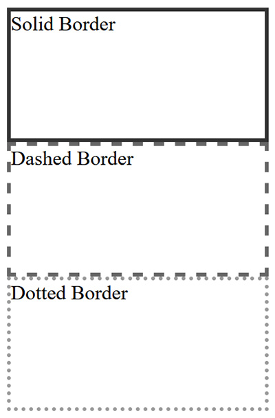
In the example above, different border styles have been applied to three <div> elements. The solid, dashed, and dotted values each produce a distinctive visual effect that helps distinguish the elements. Solid borders impart a sense of solidity and emphasis, while dashed or dotted borders suggest lightness or temporariness, which can make a section feel less permanent or more interactive.
Furthermore, developers can combine distinct styles for each side of an element, offering a higher degree of customization, ideal for advanced designs. This granular level of control is useful for creating visually complex layouts, such as promotional content that requires dynamic and varied borders to draw attention. For example:
<style>
 .mixed-border {
   border-style: solid dashed dotted double;
   border-width: 4px;
   border-color: #000;
 }
</style>
<div class="mixed-border">Mixed Border Styles</div>
In this example, the top border is solid, the right border is dashed, the bottom border is dotted, and the left border is double. Such combinations can significantly enhance the aesthetic appeal of content, particularly for special sections such as promotional banners, highlighted notices, or interactive areas. Each style serves a specific function, contributing to the overall user experience by making certain elements more visually distinct.
Moreover, border-style can be combined with other CSS properties to further enhance the visual quality of borders. By adjusting properties like border-width and border-color, developers can create borders that not only vary in style but also complement the overall theme and visual tone of a website. This flexibility allows for a cohesive and visually compelling design, seamlessly tying together different elements into a unified layout.
Best Practices for Using the border-style Property
Choose Styles Consistent with Your Design: When choosing a border style, ensure that it aligns with the aesthetic objectives of your website. For instance, a solid border conveys simplicity and strength, whereas a dotted or dashed border can add a playful or informal touch. Consistency in border style selection helps in building a cohesive visual narrative across your website, preventing inconsistencies that can make the design feel disjointed.
Combine Border Properties for Greater Control: The border-style property works synergistically with other border properties such as border-width and border-color. By combining these properties, developers gain comprehensive control over the appearance and behavior of borders. For example, a thick dashed border can highlight a focal element, whereas a thin solid border can be used for subtle visual distinction without overwhelming other content. The ability to manage width, color, and style in tandem allows developers to fine-tune the visual impact of borders to suit different needs.
Avoid Overuse of Complex Borders: Excessive use of intricate border styles can lead to visual clutter, confusing users and detracting from the content's core message. It is advisable to stick to one or two consistent styles to maintain visual clarity and cohesion. Overuse of styles like groove or ridge can create an overly complex visual environment that distracts from the primary user experience. When borders are used sparingly, they can serve as effective tools to highlight specific content without overwhelming the user.
Consider Accessibility: Certain border styles, such as dotted or dashed, may be less perceptible to users with visual impairments. To ensure your design is accessible to all users, use clear and high-contrast borders for critical elements, such as form fields or navigation components. This approach enhances usability and ensures that all users, regardless of ability, can interact effectively with the content. The choice of border style should take into account not just aesthetic appeal but also the ease with which different users can perceive and interpret it.
Use Borders to Define Structure: Borders are highly effective in demarcating content sections, emphasizing important elements, and guiding user focus. For instance, a double border can be used around critical notifications or calls to action, adding visual emphasis that draws attention. Employing borders to create well-defined content areas can help improve readability and facilitate easier navigation. This technique is particularly useful for pages with extensive information, as well-placed borders help break down content into digestible segments, enhancing the overall user experience.
Common Use Cases for the border-style Property
Highlighting Form Fields: Adding a dotted or dashed border to form fields can highlight required fields or inputs needing user attention. These visual cues assist users in quickly identifying mandatory or incorrect fields, thereby improving the overall form completion experience. Form fields with borders that stand out can make the entire interaction more intuitive, particularly for users who need additional guidance.
Creating Cards and Containers: Borders are frequently used to define the boundaries of content cards or containers, contributing to a well-organized and compartmentalized page layout. This practice is particularly useful for blogs, product showcases, or feature highlights, where each unit of information is encapsulated within a visually distinct box. Defining these areas helps users easily distinguish between different types of content, improving the overall usability of the webpage.
Emphasizing Navigation Items: Employing unique border styles, such as double or groove, around navigation elements can help these components stand out, enhancing user experience. Highlighting menu items with borders serves to guide users effectively toward significant navigation paths, thus improving the overall usability of the website. Borders around navigation items not only aid in visual differentiation but also reinforce the importance of those links in the context of user interaction.
Separating Content Sections: Borders are also valuable tools for separating different content sections on a webpage. For example, using a solid border to demarcate a blog post from user comments can improve readability, making the structural organization of the page more apparent to users. This clear delineation helps in reducing cognitive load, allowing users to understand the page's hierarchy and flow more easily.
Conclusion
The border-style property is a crucial component in a web developer’s toolkit, offering extensive customization and control over how HTML elements are visually framed. By understanding and applying different border styles proficiently, developers can introduce depth and clarity to their designs, resulting in web pages that are engaging and professional.
Whether your goal is to produce a sleek, modern aesthetic or to experiment with various visual effects, mastering the border-style property provides the flexibility needed to craft borders that enhance your website's visual presentation. The ability to selectively apply different styles allows for the creation of a user experience that is both functionally effective and visually pleasing. Borders, far from being mere visual separators, are instrumental in elevating your website's design, providing emphasis where needed, and guiding users efficiently through your content.
Ultimately, the strategic use of borders through the border-style property goes beyond decoration; it becomes an essential part of the user interface that supports functionality, reinforces hierarchy, and enriches the user's journey through your site. By thoughtfully employing different styles, developers can transform a basic layout into a sophisticated, user-friendly experience that is not only visually appealing but also purpose-driven. Thus, mastering the border-style property is a step toward more impactful, user-centered web development.HTML Border-StyleHTML Border-Style