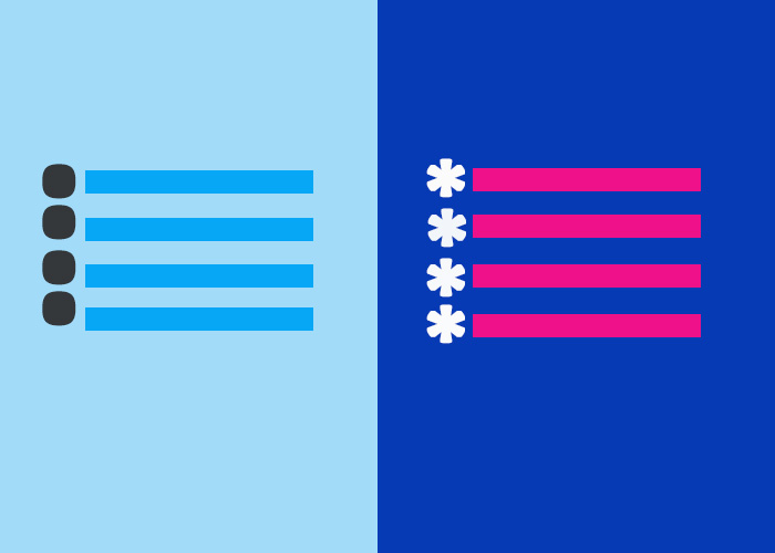
HTML provides different methods to present information effectively. Lists are one of the most versatile and practical ways to achieve this. In this guide, we'll focus on the list-style property in HTML, which is a CSS property used to control the appearance of list markers, such as bullets or numbers. By using the list-style property, you can create more visually appealing and customized lists for your website. Lists are particularly helpful in organizing content logically, providing easy navigation, and adding visual clarity to structured information. If you're just starting with HTML, you may want to explore What is HTML? A Comprehensive Guide and HTML Lists for a deeper introduction to HTML and its list types.
What is the HTML list-style Property?
The list-style property in CSS allows developers to define how list markers are displayed. It can be applied to both ordered (<ol>) and unordered (<ul>) lists. The list-style property acts as a shorthand for three separate properties:
list-style-type: Specifies the type of bullet or number used for list markers (e.g., disc, circle, square).
list-style-position: Determines whether the marker is placed inside or outside the list item.
list-style-image: Sets an image as the list marker.
Using the list-style property, you can easily control these aspects—list-style-type, list-style-position, and list-style-image—either individually or all at once for efficient customization. This makes lists more adaptable to your website’s theme and improves readability and usability for your audience.
Syntax
list-style: list-style-type list-style-position list-style-image;Each value can also be specified separately to gain more control over how lists appear. The shorthand format allows you to define all three aspects at once, but separating them provides more granular customization.
Customizing List Markers: list-style-type
The list-style-type property defines the type of marker used for a list. This can include different symbols for unordered lists or different formats for ordered lists. The following are some common values:
disc: The default bullet type for unordered lists. Ideal for general use when you want a simple and clear marker.
circle: Displays hollow circular bullets. Useful for lists that are less formal or when you want to create a lighter visual effect.
square: Displays square bullets. Suitable for creating a strong visual presence or to differentiate specific types of content from others.
decimal: The default type for ordered lists, using standard numbers (1, 2, 3, ...).
lower-roman: Displays numbers in lowercase Roman numerals (i, ii, iii, ...).
upper-alpha: Displays markers as uppercase letters (A, B, C, ...).
This property is extremely helpful when you need to visually differentiate multiple lists on a page. For example, you could use one list type for instructions, another for additional tips, and yet another for references.
Example: Using list-style-type
<!DOCTYPE html>
<html lang="en">
<head>
  <meta charset="UTF-8">
  <meta name="viewport" content="width=device-width, initial-scale=1.0">
  <title>List Style Type Example</title>
  <style>
    ul.disc {
      list-style-type: disc;
    }
    ul.circle {
      list-style-type: circle;
    }
    ul.square {
      list-style-type: square;
    }
    ol.lower-roman {
      list-style-type: lower-roman;
    }
    ol.upper-alpha {
      list-style-type: upper-alpha;
    }
  </style>
</head>
<body>
  <h3>Unordered Lists with Different Bullet Types</h3>
  <ul class="disc">
    <li>Item One</li>
    <li>Item Two</li>
    <li>Item Three</li>
  </ul>

  <ul class="circle">
    <li>Item One</li>
    <li>Item Two</li>
    <li>Item Three</li>
  </ul>

  <ul class="square">
    <li>Item One</li>
    <li>Item Two</li>
    <li>Item Three</li>
  </ul>

  <h3>Ordered Lists with Different Numbering Types</h3>
  <ol class="lower-roman">
    <li>First Item</li>
    <li>Second Item</li>
    <li>Third Item</li>
  </ol>

  <ol class="upper-alpha">
    <li>First Item</li>
    <li>Second Item</li>
    <li>Third Item</li>
  </ol>
</body>
</html>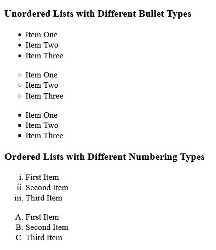
Using different list markers in various parts of your content can make your webpage more organized and visually distinguishable. This is useful when creating hierarchical content or breaking complex information into more manageable parts.
Controlling Marker Placement: list-style-position
The list-style-position property controls whether the marker appears inside or outside the list item's text box:
outside: The default value, where the marker is outside the list item box, which makes it visually separate from the text.
inside: The marker is placed inside the list item box, aligning it with the text, creating a more cohesive look.
The choice between "inside" and "outside" can affect how users perceive the structure of the list. Using inside can be ideal for short, descriptive list items where the text and marker need to be closely associated. On the other hand, using outside is preferable for more detailed items to create a distinct visual separation.
Example: Using list-style-position
<!DOCTYPE html>
<html lang="en">
<head>
  <meta charset="UTF-8">
  <meta name="viewport" content="width=device-width, initial-scale=1.0">
  <title>List Style Position Example</title>
  <style>
    ul.outside {
      list-style-position: outside;
    }
    ul.inside {
      list-style-position: inside;
    }
  </style>
</head>
<body>
  <h3>List Style Position: Outside</h3>
  <ul class="outside">
    <li>Item with bullet outside.</li>
    <li>Another item with bullet outside.</li>
  </ul>

  <h3>List Style Position: Inside</h3>
  <ul class="inside">
    <li>Item with bullet inside.</li>
    <li>Another item with bullet inside.</li>
  </ul>
</body>
</html>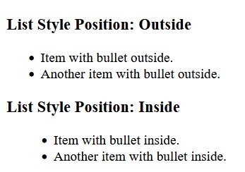
The above examples demonstrate the differences between placing the list marker inside versus outside the list item box. The list-style-position property is a helpful tool when adjusting the layout to suit different content styles and preferences.
Using Images as Markers: list-style-image
The list-style-image property allows you to replace the standard marker with a custom image. This customization adds a unique, branded touch to your website, making it visually engaging and helping to communicate more effectively with your audience.
Example: Using list-style-image
<!DOCTYPE html>
<html lang="en">
<head>
  <meta charset="UTF-8">
  <meta name="viewport" content="width=device-width, initial-scale=1.0">
  <title>List Style Image Example</title>
  <style>
    ul.custom-image {
      list-style-image: url('custom-bullet.png');
    }
  </style>
</head>
<body>
  <h3>List with Custom Bullet Image</h3>
  <ul class="custom-image">
    <li>Item with custom image bullet.</li>
    <li>Another item with custom image bullet.</li>
    <li>Third item with custom image bullet.</li>
  </ul>
</body>
</html>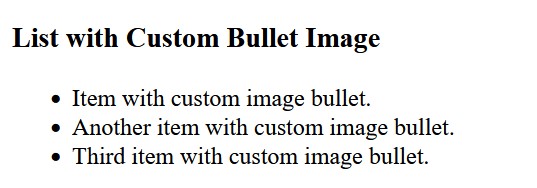
Using an image as a list marker can be particularly effective for themed content, promotional material, or lists that require a more personalized or branded approach. For example, you could use holiday-themed images for a seasonal event list or a company logo for a branded checklist to add a unique, engaging touch to your content. This feature allows web developers to break free from the limitations of standard bullet points and create visually rich elements.
Using the Shorthand Property: list-style
The list-style shorthand property can be used to set all three properties (list-style-type, list-style-position, and list-style-image) in one declaration, simplifying the code and making it more readable.
This can be especially useful when you need to apply multiple styles simultaneously without writing out each property separately. The shorthand method not only saves time but also keeps your CSS clean and manageable.
Example: Using list-style Shorthand
<!DOCTYPE html>
<html lang="en">
<head>
  <meta charset="UTF-8">
  <meta name="viewport" content="width=device-width, initial-scale=1.0">
  <title>List Style Shorthand Example</title>
  <style>
    ul.custom-list {
      list-style: square inside url('custom-bullet.png');
    }
  </style>
</head>
<body>
  <h3>List with Shorthand List Style</h3>
  <ul class="custom-list">
    <li>Item with customized list style.</li>
    <li>Another item with customized list style.</li>
  </ul>
</body>
</html>
In this example, the list-style shorthand property is used to set the bullet type to square, the position to inside, and specify a custom image—all in a single line. This shorthand method helps to make the CSS more concise and easier to manage. With list-style, web developers have a powerful tool that provides full control over the appearance of lists without sacrificing readability or maintainability of the code.
Conclusion
The list-style property in CSS is a versatile and powerful tool that allows developers to create lists that are both functional and visually engaging. By using list-style-type, you can control the format of bullets or numbering, making it easy to differentiate between types of lists. The list-style-position property helps you decide whether the marker should be inside or outside the content box, giving you more control over the presentation of your lists. Additionally, list-style-image allows you to replace the standard bullet with custom images, adding a unique touch to your lists and enhancing brand identity.
Utilizing these properties, either individually or using the shorthand list-style, enables you to create structured content that is easy to navigate and visually appealing. The flexibility offered by the list-style property ensures that your lists can seamlessly integrate with your website's overall design, enhancing its aesthetic and consistency. This also helps improve the user experience by providing logically organized information that is easier to understand and navigate.
Whether you are creating instructions, organizing items, or building a list with a specific theme, the list-style property can help you make your content stand out. Lists are an essential part of web development, and mastering the different customization options available in CSS will help you build more user-friendly and professional websites.
If you found this guide helpful, please leave a comment below sharing your thoughts or any questions you have. Your feedback is valuable and helps us provide better content for yo
